Graphic Design Admission test
My project for the admission test for Danmarks Medie- og Journalisthøjskole in 2012

My Graphic Design Admission Test
My assignment was to recreate and "copy" the following graphic designers: Cassandre (1930), Herb Lubalin (1970), Per Arndoli (1970) and David Carson (1990).
I had to look at their graphic expressions by finding their composition, shape, typography, colors and picture style... So what I should do was to create 4 posters with some specific text and to use each graphic designer's special style.
The pictures below are my final design.
Unfortunately I didn't get accepted, and I can see myself that I need a lot of excercise and experience~
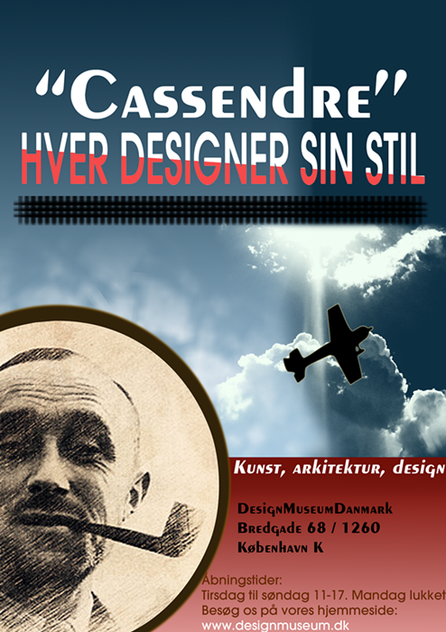
Cassendre, a graphic designer from the 1930's. His style was smokey pictures, and old technology, like trains, ships, airplanes etc. He used brown nuances and his pictures always had a gradient background. He was also known for his own font, Peignot.
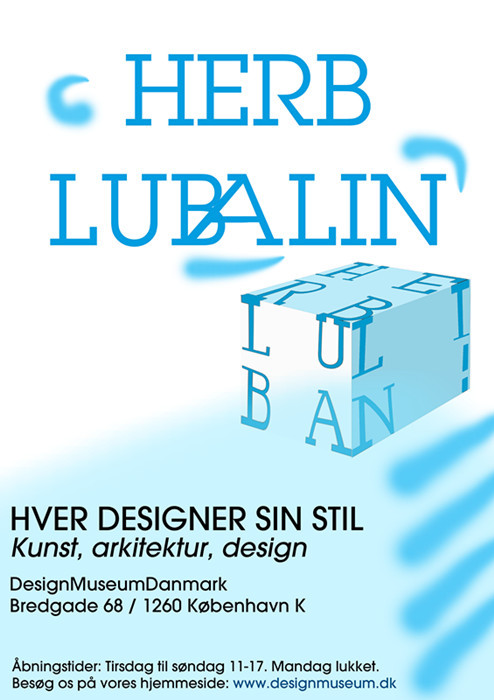
Herb Lubalin, a graphic designer afrom the 1970's. His pictures is mostly blue and white, and he uses made some big and curvy fonts. The most popular font of his is ITC Avant Garde Gothic. His typography is very special and interesting.
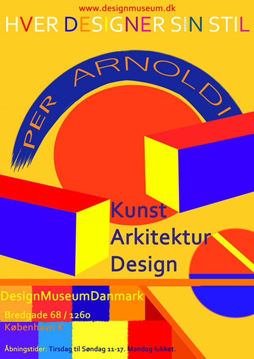
Per Arndoli, is a danish designer and artist from the 1970's. He always uses the colors blue, red, yellow and orange in his pictures. He is also known for using different shapes and lines in his pictures.
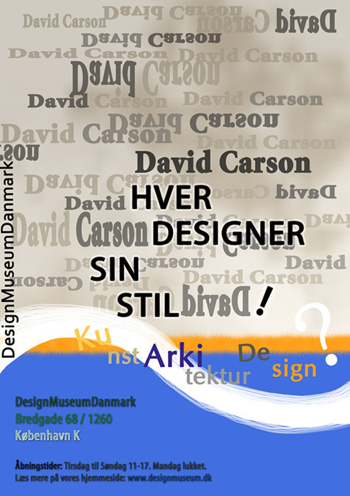
David Carson, a graphic designer from the 1990's. He is known for experimenting with typography and for his design in magasines. His pictures is confusing and the text is all over the picture, but at the same time very creative and interesting. His choice of color is varied, and he started the Garage font.